Seoul Bike - How I redesigned Seoul City’s public bicycle system
Note: I wrote this article in 2017, and a lot has changed since. In addition, I am writing a follow-up article about the service, so look out for this later this month.
Case study background #
In my humble opinion, when a UX design beginner takes his first steps in the field, a great way to learn something new is through practice, practice and some more practice.
With this in mind, I had to dip my toes in this new field by creating a UX design case study. However, I had no idea what a “case study” is and how to proceed with it. Thus I contacted a classmate from my university with the most work experience and organised a casual meet-up. Little did I know that this will be the beginning of a weekly “study” event, where the two of us work on our own side projects.
Designer’s Sunday: The Beginning #
On a rather chilly Sunday morning, in a coffee shop somewhere in Seoul, I met up with my friend, and we created a small “study” circle we call “Designer’s Sunday”. I brought my laptop and a small notebook to our first meet-up, and this was how this case study came to be.
I researched the app, trying to understand its architecture, the reason behind the app’s design and how the service worked as a whole, followed by a lot of sketching (a looooot of sketching). During the research phase, I stumbled upon various problems, some of which stem from the service itself and others from the app design. But let’s not steer too far away for now.
What is “Seoul Bike”? #
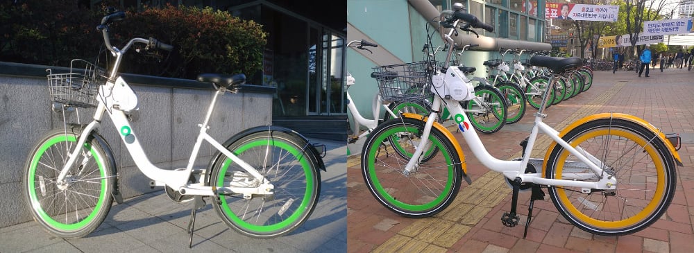
1st gen (left) and a 2nd gen bicycles (right donated by the Dutch embassy)
Seoul Bike or “따릉이” (Ddareungi) is an un-manned bicycle rental system deployed in Seoul and operated/funded by the metropolitan city government. The system’s coverage and ability to return a bicycle at a different location (as long as there is a rack) is its most significant advantage over the competing services. This system keeps the city free of randomly parked bicycles everywhere (or on a tree… or in a river…).
Disclaimer: Since 2017, the landscape has drastically changed, and the electric scooters have killed most shared bicycle startups, thus making “Ddareungi” the dominant bicycle-sharing/rental service in Seoul.
The bicycles #
There are three generations of bicycles that look very similar and are very hard to distinguish. Most of the fleet was donated by large corporations, but information on who and how many has not been updated for some time. The only information I could find was, Samsung Group donated 3,000 units and installed 300 racks in 2017, while some of the donated bicycles by Naver Corp., Kakao Corp., Woori Bank, and even the embassy of the Netherlands.
The bicycle itself is relatively simple and nothing fancy. It’s composed of simple three gear transmission, a retracting seat specially made only to fit these bicycles (bicycle seat theft is still a thing for some reason), and a touch screen user interface with a single button and a speaker. There is also a locking mechanism for locking the unit to a designated rack or temporarily locking it to a pole when you have to leave it for a while. Finally, the touch screen allows you to check how much time you have used the bike for in the middle of a ride, travelled distance, and total burned calories for the current session.
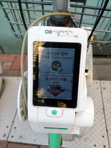
On-board touch screen interface
The service utilises multi-use “tickets” which expire after an amount of time, from a single day, a week, up to a whole year. For example, a single-day ticket costs 1,000 won and expires 24 hours after purchase with long term tickets going from 7 days (3,000 won), 30 days (5,000 won), 180 days (15,000 won) and 365 days (30,000 won).
A rather clever system is implemented to prevent bicycle hoarding, with the default amount of time a user is allowed to use the bicycle is 1 hour (normal) or 2 hours (premium). If the user goes over the time, a very cheap penalty imposed requires the user to pay a few hundred won every 10 minutes. These penalties are taken care of when the bike is returned to a bike rack from the app, and until the payment is complete, the service is limited. The system of tickets and use time can be confusing at first, but the low price does not impose extra stress on the user. Furthermore, as I mentioned, a ticket is multi-use which means that a user could always return a bike to a rack and rent it again straight away.

The renting process is only done through a mobile app that until recently was Android only. And here come a handful of problems… First, the app is overcomplicated, the whole user flow is off, and it’s riddled with misplaced assets and bugs.
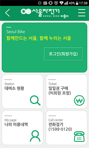
The first screen you see when you open the app
Let’s start with the main page. The page that welcomes you when you first start the app is pretty basic. You have a Login button, a Station button that takes you to the map that marks the locations of the racks and how many bikes are available. Unfortunately, renting isn’t possible from this page. Then there’s a Ticket Purchase button and a My Page button which contains information about your rides. There’s also a Call Centre button for when you need to ask for help.
One thing that you might have noticed is the back button on the top left of the screen. A “back” button on a home screen? Why? Where does it lead you? It’s simple, the button that leads you nowhere. And a “hamburger menu” button on the right forces the menu to pop out from the left of the screen. Why, you might ask? It’s a mystery.
My solution #
Login #
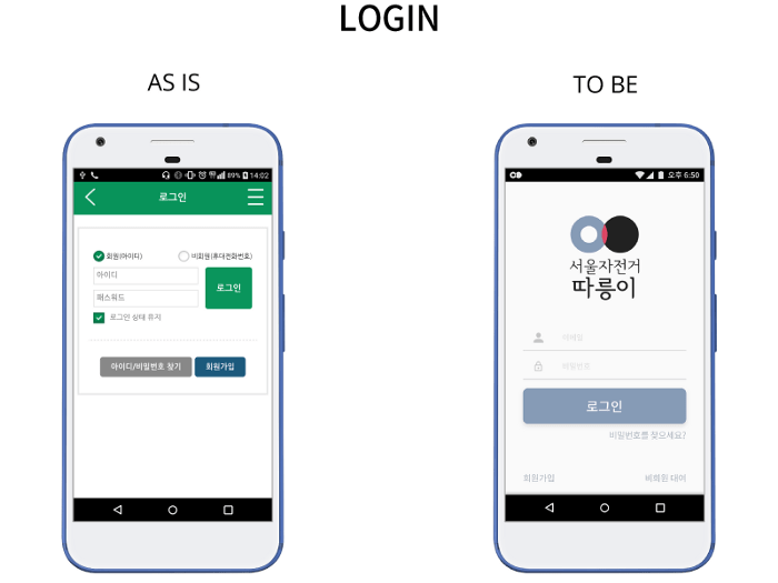
The current design requires a user to log in and proceed with the service. It has the option of remembering your username and password. But upon closing the app, the user is logged out, creating this mandatory Login Page tap — that could be bothersome, especially if you are in a hurry. The Login screen should be a one time experience for a mobile app because, after all, a mobile phone is a personal device that is rarely left unattended.
The app does not store credit card information and other sensitive data requiring protection with a mandatory automatic log out. With the redesigned experience, the app will protect any sensitive data with a password prompt. This prompt is expected to add an extra layer of protection from undesired third parties aiming for the user’s payment information.
Main #
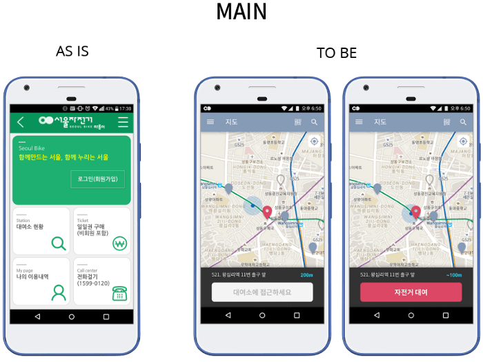
As a bicycle rental service, Seoul Bike should first show the user a map with locations around him from where the person could rent. Then, with a single glance of the screen, the user should see the currently selected bicycle rack and the others in the vicinity. Availability should be easily distinguishable, and car rental apps like Socar and Green Car are great examples.
A significant problem I noticed when using the service for a whole year is that many users tend to rent a bicycle that is too far away, which prevents people at the rack from renting a bike and forces them to wait. Currently, if you rent a bike and do not take it within 5 minutes, the rent is automatically cancelled. So waiting for 5 minutes is not that big of a problem, but nobody likes waiting in the current fast-paced lifestyle. For me, as a user who start my morning commute to work, waiting for 5 minutes is not an option, so this particular problem required a solution.
To prevent such occurrences, I designed the service to use the mobile devices GNSS feature and track the location to fix this problem. This solution will check if the user is within 100 meters of a rack before renting a bike. A regular GNSS in a modern smartphone has an accuracy of between 50 meters and 100 meters, a relatively safe distance because a stretch of 100 meters means the user could physically see the rack (if nothing is in the way) and require just a few seconds to approach it.
The service could use the position data to improve itself by analysing how users move with the bikes, when the peak hours are, and which areas require extra management. Currently, there is no such data for analysis, and some areas where the bicycles are part of the morning commute are not appropriately managed.
This data could prove to be essential for an ever-growing city with overpopulation and traffic problems. In addition, an affordable and reliable network of bicycles could ease the other means of public transportation, something that Seoul City needs to concentrate on fixing to improve the quality of life of its citizens.
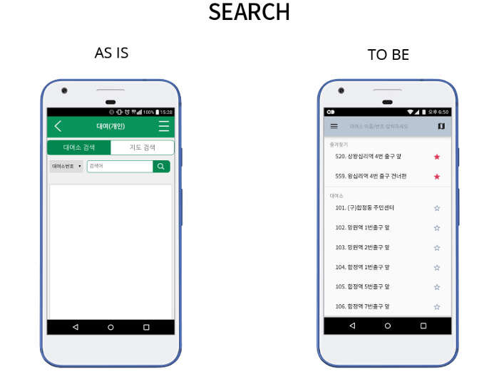
There are manual options currently used in the app, such as manual search and QR code scan. They are pretty helpful in the event of a GPS error or if the user’s location is unavailable. For example, the user could always search for a rack by its unique number, name or scan a QR code attached to the stand. The search screen can also contain favourite locations personalised by the user, a feature that provides a much-needed feeling of customisability.
Notifications #
Let’s take a look at the following scenario. A person had to stay late in the office, so he went home a tad late, which made them sleep over a few alarms. This person was me, so I speak from experience. Some mornings when I am in a hurry, I get a very unwanted surprise now and then. A message “You do not have a ticket, purchase one first and try again” comes from the bicycle, an announcement you don’t want to hear when in a hurry. Sometimes when I needed a bike the most, there was none at the location near where I lived. And such uncomfortable situations were a surprise I did not enjoy, but a surprise nonetheless.
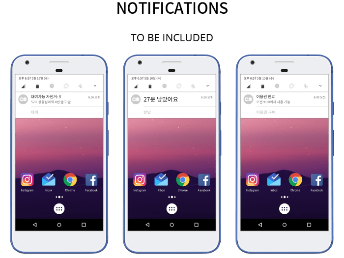
The app could display some essential information through non-intrusive push notifications to prevent “happy little” accidents like those mentioned above. Here are a few simple examples. Information such as the current number of bicycles (at a favourite rack). Or the remaining ride time of the current ride. Or maybe a simple notification of an expiring ticket. With elementary messages, a user can be aware and prepare accordingly. But such a notification feature could be potentially resource-heavy on the back-end. So to reduce the load on the servers from a constant barrage of server pings and reduce background mobile data usage (lower data bills and battery use), the user is required to select a specific time frame for the features to work (e.g., morning commute between 08:30 and 08:45).
For this scenario, let’s imagine a person called Zoe. Zoe lives in an area with no direct bus to the subway station, which she uses daily to commute to work. The walking distance is roughly 14 minutes, but with a bicycle, she can go in 5. Unfortunately, with the increased popularity of the bikes, she is often forced to walk in a hurry because there are no available bikes on the rack.
With this feature, she adds the nearest bicycle rack to her favourites. Next, from the app settings, she turns on notifications from 08:00 to 08:20. These notifications provide updates on how many bikes are available at her favourite bike rack helping her plan time in advance if she needs to walk to the metro station.
Menus #
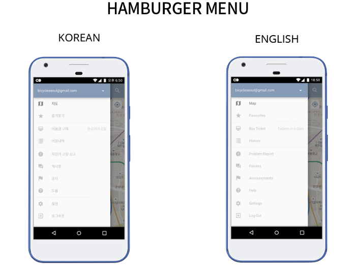
The menus hidden under the “hamburger” button are like the app’s map. Therefore, by grouping features together, the user can easily remember their locations on the screen and on top of that, it can inform the user with essential information.
One of the most uncomfortable aspects of the current app is the difficulty of finding how much time the existing ticket has left. The app could display this information in a proxy location, and the hamburger menu is just the perfect place. In my design, the side menu includes real-time information on the current ticket status and does not require the user to enter a particular page to view it.
Payment #
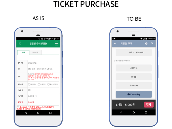
Korea, especially government-operated online services, is obsessed with complicated security, making the ticket payment stage very frustrating. Most government websites and services use a process of payment that is rage-infusing and could drive you mental. There’s Active X, mobile phone authentication (sometimes several times) and a ton of other steps to spend 5,000 won. I can’t count the times I gave up buying something online because the payment stage left me speechless.
A payment process should be secure yet quick, so the “Ticket Purchase” pages required an overhaul. Third-party services such as Kakao Pay or Naver Pay are simple, easy, fast, and just the perfect solution to improve the payment user experience.
Problem Report #
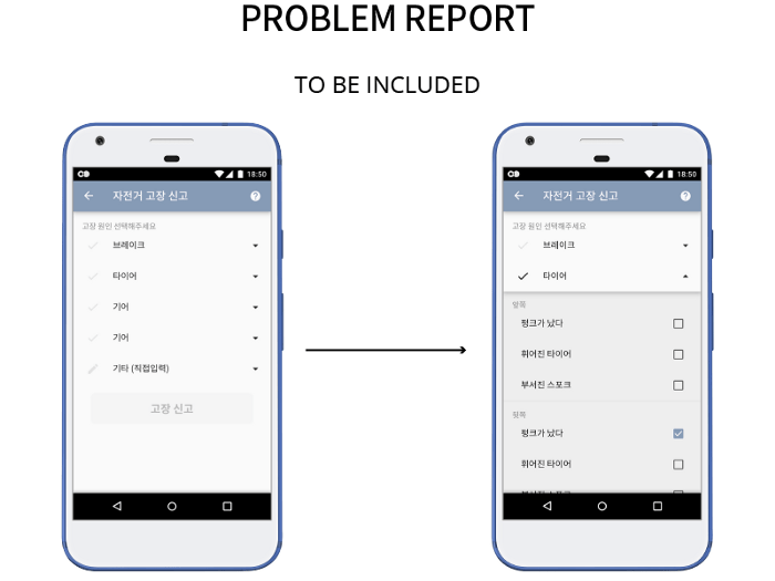
Unfortunately, I couldn’t find any usage statistics. But the service has an ever-growing user base, and I have noticed many more problematic bicycles on my daily commutes. Maintaining a growing garage of bikes would require a substantial workforce that could be out of budget for a local government. With the help of the users, the local government could engage the local repair shops and create an ecosystem where all parties could benefit.
Currently (as of 2017), the app has only a call centre where you could ask for help or report a problem with a bicycle. The service is designed in such a way that prevents problem tracking. For example, suppose a bike breaks down while using it. The user could return it to a rack and leave it broken for the following user, who, in turn, could go out of his way and report the problem or just go for a different bike because there is no benefit in reporting. Designing a reward-based system is what Seoul Bike needs.
A categorisation of the most frequent problems could simplify the report page and ease the whole process. On top of this, this system also makes it easy to keep log data while providing the necessary information to the engineers, who can then prioritise tasks. Under every significant category, there are more detailed options just a tap away, such as punctured tire, bent wheel or spikes and so on. If the problem is not part of these categories or something extra you want to explain to the engineers, there is a message option under the “Other” tab.
Epilogue #
P.S. Why from Green to Blue and Red? #

Seoul City had a very controversial re-branding last year. But there is a lack of unification between the services that the city government provides and the branding. I get why the current colour on the app and the logo is Green — bicycle = Eco-friendly, Eco-friendly = Green. Let’s stop the over-use of the green colour when branding eco-friendly products or services.
Seoul invested a lot of money in re-branding itself. However, there needs to be consistency in the branding of its services, so I chose to use a derivation of the two colours used in the meme generator that “I •SEOUL • U” is. Slightly tweaked blue and red from the city brand creates a nice contrast — with white and black and almost all shades of grey. Thus it becomes easier to create a hierarchy with the colours, even for the colour blind users. Usability was my main focus, not only with the colour pallet but with the whole design.

The logo that set the Korean design community on fire.
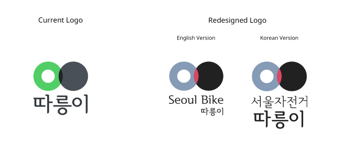
Brand consistency is something that should be enforced throughout all Seoul City services.
Free UI Kit #
After working on this project in my spare time, I got inspired by two people to release the file as a UI kit. One of the people I was inspired by is a university friend of mine, who worked for two years on creating a Korean font (Busan Bada/부산바다체) and released it for free.
Another inspiration was Heeyeun Jeong, the creator of Open Color and her interview on the Design Table podcast (lang: Korean). Her views on Open Source projects were inspirational and a big motivator for this free UI kit. Moreover, a few weeks ago, the team at Bohemian Coding released Sketch v47 and the “Libraries” function - which takes symbols to a whole new level. So by sharing my Sketch file with the world, I hope I can help someone with some of the assets I made.
As an Android user, this project was designed with Google’s Material Design guidelines, but in the future, I plan to update the file with an iOS cantered design (I can’t promise because my time is finite). However, the symbols and buttons I put together are free to use, so please include them in your Android or iOS Sketch Libraries!
Download the free UI Kit here For pre-views of some of the symbols in the file, click here.
This UI Kit is free for personal and commercial use. If you use this kit as part of your work, mentioning it is greatly appreciated.
The UI design itself is copyrighted, so please do not upload it on Dribble or Behance and claim it as your own. That would be really uncool. Like reeeaaaaally uncool…
Cheers, and keep on creating!
You can find me at www.martintotev.com, follow me on twitter or shoot me an email at hi@martintotev.com.
Special thanks to Sang Hyeon Park for becoming my mentor and guiding me into the fantastic and exciting world of UX Design.